Mojaba: Mobile Web Solution
In today’s digital era, having a strong mobile presence is crucial for businesses to thrive. Torsion Mobile is proud to present Mojaba, our latest Software as a Service (SaaS) tool designed to empower creative professionals in building stunning and impactful mobile websites for their clients.
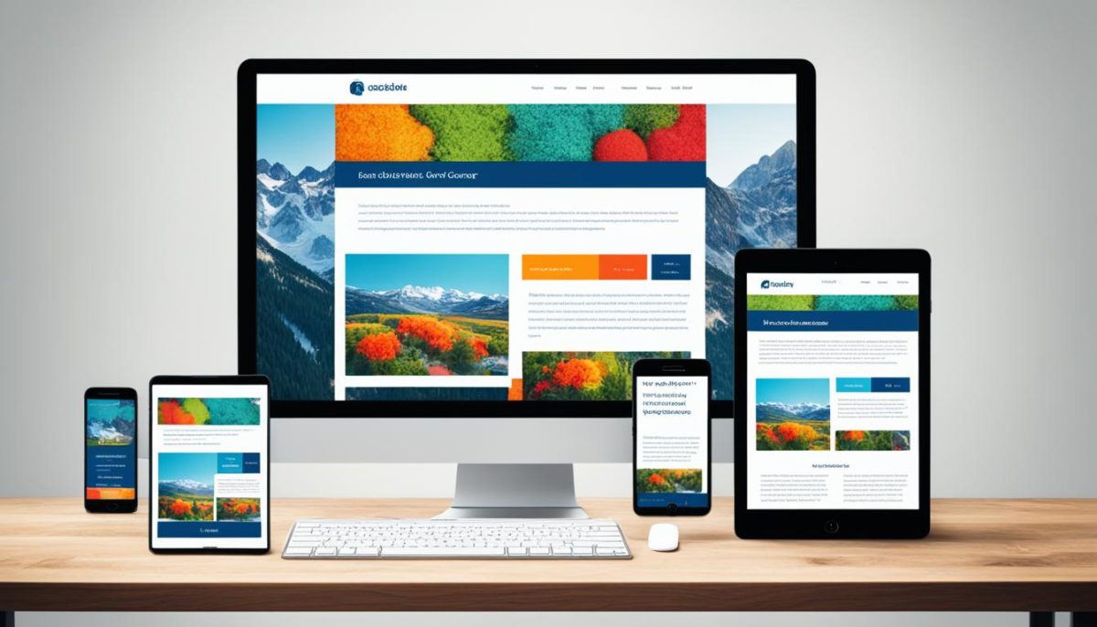
Mojaba simplifies the process of creating mobile websites, offering an intuitive platform that allows users to unleash their creativity and design captivating mobile experiences. Whether you’re a seasoned designer or new to the world of mobile web development, Mojaba provides the tools and support you need to craft beautiful and effective mobile websites that captivate audiences and drive results.
Key Features of Mojaba:
- User-Friendly Interface: Mojaba boasts a user-friendly interface that makes mobile website creation a breeze. With drag-and-drop functionality and customizable templates, designing mobile websites has never been easier.
- Mobile Optimization: Mojaba ensures that all websites built on the platform are fully optimized for mobile devices, providing users with a seamless browsing experience across all screens and devices.
- Marketing Support: In addition to providing a powerful web design tool, Mojaba offers marketing support to help agencies sell mobile solutions to their clients. From sales materials to promotional resources, we’ve got you covered every step of the way.
- Affordable Pricing: Our business model is designed to provide customers with an affordable solution while offering a comfortable profit margin for agencies. With Mojaba, you can deliver exceptional value to your clients without breaking the bank.
Why Choose Mojaba?
- Innovative Solution: Mojaba is at the forefront of mobile web development, offering cutting-edge features and functionality that empower creative professionals to excel in their craft.
- Seamless Integration: Mojaba seamlessly integrates with existing workflows, allowing users to easily incorporate mobile website design into their projects without any hassle.
- Exceptional Support: Our team is dedicated to providing exceptional support and guidance to Mojaba users, ensuring that you have everything you need to succeed in building beautiful and effective mobile websites.